Design made in Switzerland: 5 iconic Swiss products that play with the colour red
Red is considered threatening and agitating and yet, the colour has found its way into many Swiss designs. Product designer and curator Gabriela Chicherio explains to me what it’s all about.
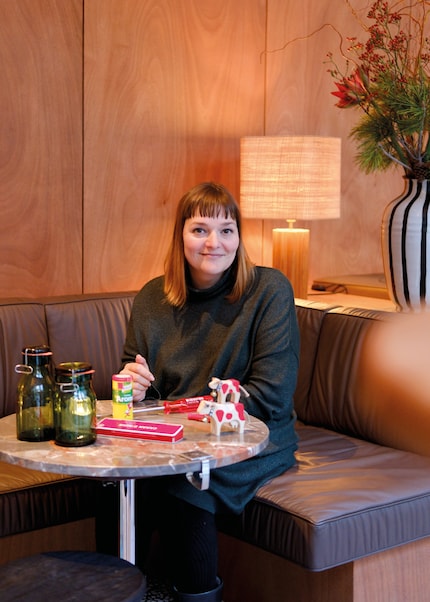
Zurich-based Gabriela Chicherio never wanted to put all her eggs in one basket. That’s why she’s been pursuing various goals since completing her product design studies at ECAL (École cantonale d'art de Lausanne). She’s designed furniture in her own name, for Beat Karrer or brands such as Ligne Roset, assisted in industrial design at the ZHdK and founded the Design Biennale together with Andreas Saxer. Although she’s always been interested in international design, her curiosity grew with each new project, primarily to convey Swiss design. This is how she came up with the idea of offering walks through Zurich to explain the designs in public spaces that originated in Switzerland. At the same time, she launched the radio play project Design Storyphone, in which she tells the stories of well-known everyday products such as the Victorinox peeler «Rex», Aromat or Omega drawing pins. The amazing thing is, many of the Swiss companies mentioned have been playing with the colour red since they were founded. They seem to use the colour to emphasise the design quality. Even despite the fact that it’s often used to express danger or even anger.
Why do you hype everyday objects of all things?
Gabriela Chicherio, product designer: I’d like to contradict the suspicion that design is a luxury. Many people think it’s something elitist. Consciously or unconsciously, we’re constantly confronted with design. For example, when furnishing our home or choosing learning apps and games.
Even the Caran d'Ache pencil, which almost every schoolchild in Switzerland seems to use, is design.
Source: Pia Seidel
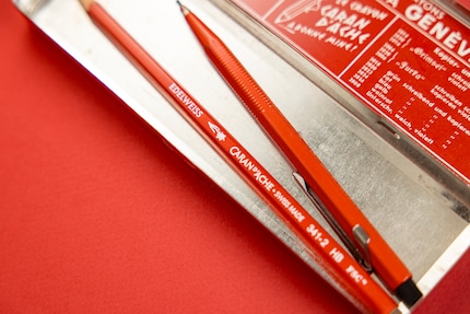
The Geneva-based stationery manufacturer seems to have celebrated the colour red with its logo and products from day one. What’s the brand so well known for?
Caran d'Ache was and is particularly innovative. It was the first company to introduce the mechanical Fixpencil with a clutch mechanism in 1929 and the water-soluble coloured pencil Prismalo in 1931. Their Neocolor wax pastels were used by Miro and Picasso, and their red pencils by most children in Switzerland. The company is also committed to producing an increasing proportion of its pens from certified Swiss wood.
How is the pencil made?
It’s made of graphite and wood in the canton of Geneva. First, the lead is made from a mixture of graphite, clay and water. This is then pressed into a thin rod, burnt and finished with a mixture of waxes. The leads are securely glued into two precisely cut wooden boards. The individual pencils are then separated from each other with a milling machine, creating the hexagonal cross-section. This prevents the pencil from rolling away on an uneven surface. If Caran d'Ache were to line up the pencils it produces daily lengthwise, it would stretch from Geneva to Rome – almost 700 kilometres.
Source: Christian Walker
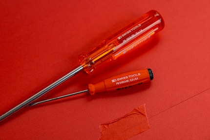
PB Swiss Tools, a company with long-standing tradition, has been around since 1878. It also uses a red handle for its screwdrivers. What’s behind all of this?
Its red handle is made of cellulose aceto-butyrate (CAB). This plastic is produced by a chemical reaction of cellulose with a mixture of acetic and butyric acid, which usually causes an unpleasant smell. To counteract this, PB Swiss Tools add a subtle vanilla fragrance to the handles to neutralise it. I can’t say whether the red is intended to underline the Swissness or is just a good contrasting colour.
How’s the screwdriver shaped?
Although the handles are formed using the standardised injection moulding process, the metal is made from an extra wear-resistant special alloy similar to spring steel, which is produced according to a special formula created by PB Swiss Tool. What’s special about this company is that the design always derives directly from the ergonomics and the application. Since function is key, there are no purely decorative elements.
Source: Christian Walker
Which brands also celebrate red in their design?
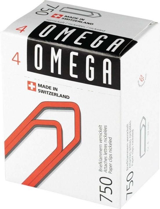
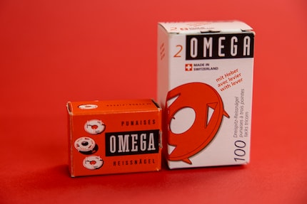
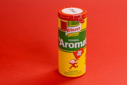
Red was the main element of the packaging for Omega drawing pins. The red lid on the Aromat shakers also play a prominent role. The German company Knorr expanded into Switzerland in 1907 and after the Second World War, they concentrated exclusively on the Swiss market and their taste. Aromat was launched in 1953 and to quickly get their foot in the door, Knorr distributed 30,000 boxes of the seasoning to Swiss restaurants. But the red, green and yellow graphics also stood out on every shelf. The packaging design was created by Armando Rutelli, a trained textile and advertising graphic designer. In the 1960s, Ticino graphic artist Hans Tomamichel added the little pixie called Knorrli. Knorrli became a brand ambassador and popular figure for the entire Swiss Knorr range.
Source: Christian Walker
Source: Christian Walker
What’s unique about the packaging?
Initially, the shaker had an opening at the bottom for refilling. The holes were part of the shaker and were covered with an additional lid. Today, packaging is optimised for production. The plastic lid combines all the functional elements and has a hinge for opening. This enabled them to save on an additional piece.
Red is also a feature of the Trauffer cow. Which marketing or design elements does it combine?
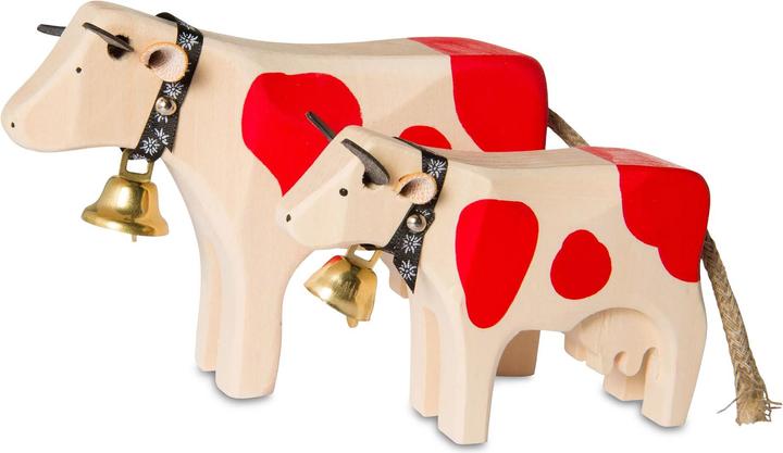
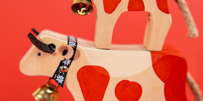
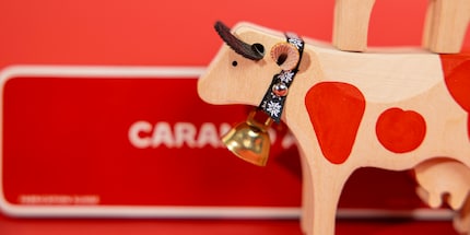
The abstract wooden cow comes from the Bernese Oberland, which is famous for tourism and wood carving. It’s considered a typical souvenir and is sawed, carved and painted from blocks of wood. Its ears are punched out of leather. Many steps are done by hand, but the most impressive, in my eyes, are the red patches. It’s not like the cow is supposed to be realistic, so the red patches are iconic.
Source: Christian Walker
The signal colour red is considered tactically unwise and commercially less successful in product design, so how are these little cows so iconic?
I wouldn’t say that red is tactically unwise. Red is eye-catching, loud, characteristic, radiant and also embodies Swissness. The Trauffer cows have cult status because they’re well designed and functional. Many of the products we talked about also end up in the cupboard or are very small, so most people don’t care about the colour. With larger home accessories and furniture, on the other hand, many people fear that something red will quickly wear out. Subconsciously, they fear doing something wrong or regretting the decision. So people prefer to use a neutral, «simple» colour because they don’t trust their own taste enough.
Have you ever designed anything red?
I didn’t set out to design something red. But one of the tables I designed happened to come in red. Unfortunately, the colour didn’t sell well. That’s why I have one of them at home today. It did better in a light citrus yellow or light green. White and anthracite performed best, as you can imagine.
Is it perhaps because red stirs things up indoors? According to colour psychology, it’s the most stressful of all colours...
I do believe it’s something to consider when it concerns hospitals or prisons. I’d also be cautious with those settings. But why can’t a living room or bathroom at home be invigorating? If in doubt, paint a wall red or choose a red piece of furniture or accessory. There’s no such thing as too bold, only too boring.
This article was created as part of our Focus Week on the colour red. Seven days, seven articles. You can read more about this and all the articles published so far here:
Like a cheerleader, I love celebrating good design and bringing you closer to everything furniture- and interior design- related. I regularly curate simple yet sophisticated interior ideas, report on trends and interview creative minds about their work.
Interesting facts about products, behind-the-scenes looks at manufacturers and deep-dives on interesting people.
Show all
