News + Trends
Cell renewal at Microsoft: Are the new Office icons just the beginning?
by Martin Jud

On with innovation: Microsoft is optimising 100 icons with Fluent Design. New colours, materials and finishes are intended to underline the simplicity and performance of their products.
A year ago, Microsoft debuted the new Office icons in Fluent style, announcing the start of a step-by-step all-round rework. One to be implemented both on devices and cross-platform (following article in German).
The Windows 10X announcement was followed by a new Windows logo. The first products to be launched on the market next summer or autumn with the OS designed for dual-screen units are the Surface Neo and Surface Duo. Thanks to these devices you'll get a revised start menu, which works without live tiles.
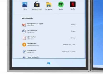
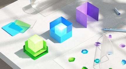
Now Microsoft has extended the redesign to 100 icons of various company programs. It's time for new colours, materials and finishes:

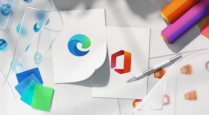
If you look at the icons side by side, you'll notice that Microsoft pays special attention to consistency in their revised design. The harmony created is mostly based on subtle optimizations. For programs whose icon also has a letter, it's cleverly separated from the symbol.

What do you think about the new Microsoft coat of paint? Is it compatible with the products or is it going in the wrong direction?
I find my muse in everything. When I don’t, I draw inspiration from daydreaming. After all, if you dream, you don’t sleep through life.
From the latest iPhone to the return of 80s fashion. The editorial team will help you make sense of it all.
Show all