Background information
White, but not boring: the 2026 trend colour polarises
by Pia Seidel

The year 2000 was the first time Pantone declared a colour of the year. Now, over two decades later, a brown hue has won for the very first time. Its name: Mocha Mousse. However, this choice hasn’t been getting much love.
Remember Pantone’s last colours of the year? Soft purple Very Peri, strong fuchsia Viva Magenta or salmon-coloured Peach Fuzz? They were all bright or candy-coloured eye-catchers. Now, for the first time in 25 years, a shade of brown has been chosen – and it’s dividing the internet.
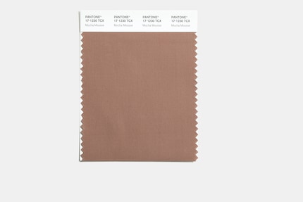
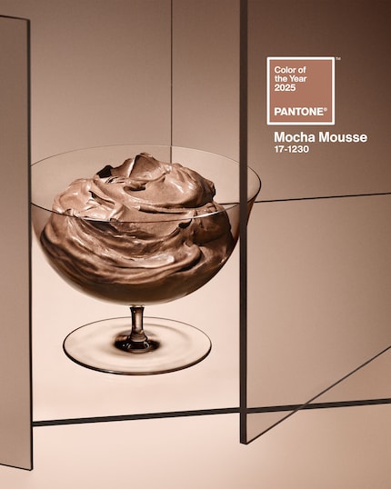
According to Pantone, the colour will play a major role in 2025. The shade’s called Mocha Mousse and intended to appeal to our sense of taste and smell. Pantone calls it «an evocative soft brown [...] with its suggestion of the delectable quality of cacao, chocolate and coffee, appealing to our desire for comfort.»

Sounds delish. The problem is that Mocha Mousse just doesn’t have those qualities. It fails to be a dark, rich brown shade that conjures up fantasies of chocolate or espresso and has been so popular this year, especially in fashion. Instead, Mocha Mousse holds back and is indecisive. It looks like a brown that actually wants to be a dark beige. Accordingly, the things people are associating it with are all over the place. Is it Ovaltine or a muddy puddle? Coffee-flavoured yoghurt or dull dishwater? In the end, the association is entirely in the eye of the beholder.
It seems it’s not the colour brown per se that’s dividing people, it’s the shade Pantone’s gone for. The famous Instagram account Diet Prada collected X/Twitter reactions to the colour of the year in a post. Many of them aren’t very positive. The comments section of the post has been a platform for many to express their incomprehension about the chosen colour. «I love brown, but this isn’t the brown I love. This brown is very...lacklustre,» one user writes. Another commented: «A rich chocolate brown would’ve been nice instead. This is greyish and dull.»

Indeed, Mocha Mousse isn’t giving off a very contemporary vibe. «It’s giving Sad Beige and we ran through that in 2016–2020,» one user objects. The term Quiet Luxury keeps popping up in threads discussing Pantone’s new favourite tone. Frankly, that’s just a buzzword everyone’s sick of hearing. It’s a pity, given that the colour of the year should be more of a trend forecast than a retrospective.
Some people are wondering if there’s a socio-political message behind Mocha Mousse. «A colour that signifies how much sh*t we’re going to deal with,» reads an X/Tweet highlighted by Diet Prada. «Great depression core,» another person mocks. Another says: «Colour trends reflect the spirit of the times. It’s a depressing choice, but these are depressing times.»
Laurie Pressman, Vice President of the Pantone Color Institute, also explains to Npr that the colour of the year is meant to capture the zeitgeist: «It’s us taking the temperature: what’s taking place in the world around us and how does that get expressed into the language of colour?»
However, the fact that Mocha Mousse feels depressing to some people is exactly the opposite of the desired effect. According to Laurie Pressman, it’s emblematic of a snapshot in time and it’s giving people what they feel they need — that that colour can hope to answer. During Pantone’s research for this year, they realised one thing in particular: people’s longing for harmony and their need to feel grounded.
And indeed, Mocha Mousse is conveying this feeling for some: «I love this colour and find it very calming,» one comment reads below Diet Prada’s post. «It’s a solid, neutral tone, peaceful and grounding. I think that we will need this energy in the coming years,» says another comment.
Ultimately, the perception of colours is a question of your personal perspective – what radiates tranquillity for some may feel oppressive to others. Which associations does Mocha Mousse evoke for you?
Has endless love for shoulder pads, Stratocasters and sashimi, but a limited tolerance for bad impressions of her Eastern Swiss dialect.
Interesting facts about products, behind-the-scenes looks at manufacturers and deep-dives on interesting people.
Show all